
A modernist-inspired subtropical home
The Long House is a simple, contemporary home that takes advantage of angles and shapes to control light and create a playful and modernist feel.

The Long House is a simple, contemporary home that takes advantage of angles and shapes to control light and create a playful and modernist feel.
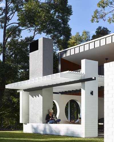
As the home is set on a tranquil acreage in Chandler, Queensland, the architect was able to develop an elongqated, linear floorplan that stretches along the east-west axis to capitalise on the north-eastern exposure. The architect also decided to create an outdoor room defined by white brick walls that create a barrier without obscuring views to the landscape beyond.

The outdoor room with its large circular apertures adds depth and interest to the house, while allowing natural light to flow through. Used along the entire ground floor, the white brickwork also helps create the mid-century modern look that the clients were looking for.
“The clients were interested in mid-century modern work, referencing white painted brick specifically, but they also wanted to contextualise the house in the sub-tropics,” says architect Shaun Lockyer, director of Shaun Lockyer Architects.
“To this end, we proposed a mix of simple modern forms with some playful combinations of simple, timeless materials. We chose a random selection of PGH Bricks and had them painted in Dulux’s Lexicon Quarter Strength ‘PCWF4’.”
According to Lockyer, brick was an ideal choice because it responds to the local vernacular, which is mostly brick veneer construction. The durability of brick is also well-suited to a home in the sub-tropics.
“I think this house is a great example of ‘simple done well’”, says Lockyer.
“The only challenges were to do with planning, title and some technical issues regarding the drainage and foundations. However, these were overcome very early on in the process and the builders, M2 Construct, did a fantastic job, completing the project on time and on budget.
“Architecturally, this project represents a great example of how with relatively limited means, something interesting can be achieved. The restraint of architectural form and minimal palette offered constraints that made for a better final outcome and we were lucky to have clients who valued the principle of quality over quantity and moved forward with this idea.”


