
A three-level house with six levels by Melbourne’s OOF! Architecture
And no, that wasn’t a typo.
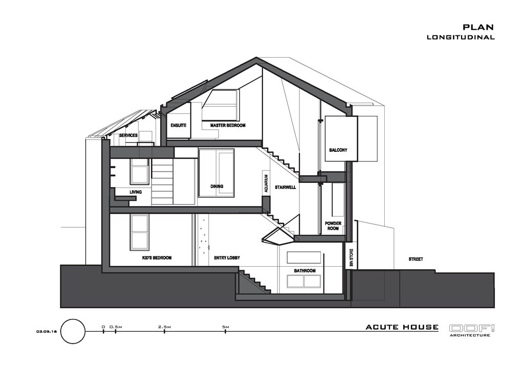
When confronted with the triple-threat challenge of small space, odd geometry and heritage constraints, OOF! Architecture’s solution was to create six levels within a three-level house.
And no, that wasn’t a typo.
OOF! received the design brief for the Melbourne abode from a young couple with a child. The house is a diminutive, corner-dwelling structure. Yet, despite size constraints, it needed to contain a home office, a child’s bedroom, a parents’ bedroom, and additional living space. On top of that, the family desired some sort of a garden.
It was a multi-pronged challenge for which OOF! came up with a creative solution.
“One of the key things was to create a design strategy that minimised all of those useless things that take up a room, like walls, doors, corridors – all the empty spaces. The way to get rid of those is to split up the house into split levels. We’ve got a three-level house, but it’s actually done in six levels, each a half-level up from [the one below],” says Fooi-Ling Khoo, the project’s architect.
“This separation meant that each of those split levels is sort of a room in itself, so that you can actually separate different areas. [They all have] their own sense of definition and visual clarity without the need for walls or doors.”

Between these six spaces, OOF! managed to fit all of the brief’s requirements. While some of this potential was created by the architects, some of it lay untapped within the existing design just waiting to be recognised.
“One of the great things about really strange sites is that you discover things about them as you’re working on them,” says Khoo. “The key is to recognise when there’s great potential for something.”
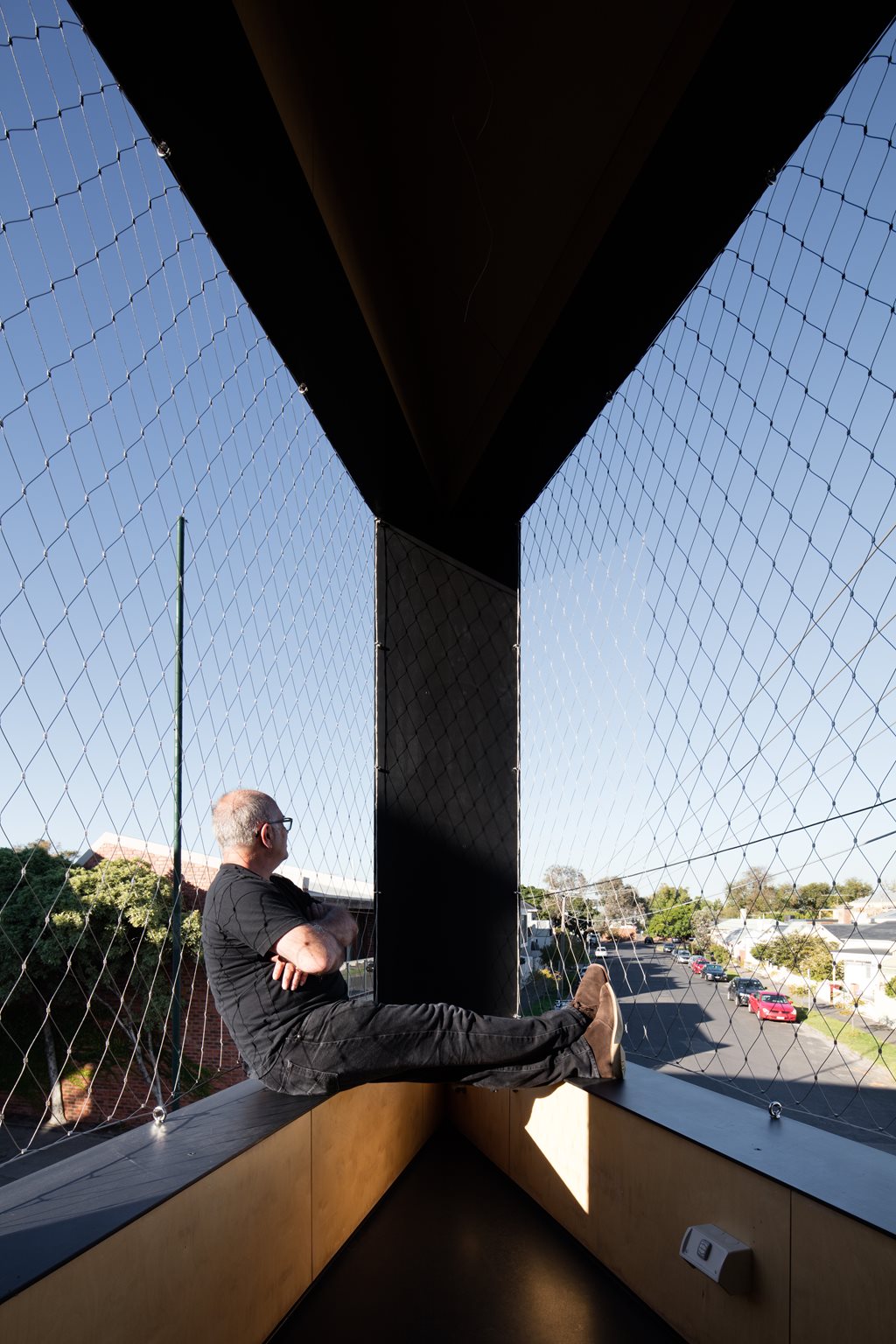
For instance, the designated balcony area was tiny and oddly-placed. From this spatial challenge, OOF! simply excavated an imaginative solution.
“The very small balcony area that we had was in the very narrow, triangular bit of the house. On the one hand, you might go, ‘That’s too small!’. [But] what is also means is [that] when you’re out there, it’s like you’re standing on the prow of a ship. When you’re out there, it’s like you’re sailing down the street.”

Obviously, considering the cramped floorplan, it was important that this didn’t turn into a feeling cramped-ness for the occupants. To combat this, OOF! ensured that none of the areas within the home were dead-ends. Each ‘room’ has two ways of getting in and out, so that residents aren’t forced to do exit dances around each other each time they interact.
“There were no dead-end areas on the floorplan,” says Khoo. “There’s a clean flow-through on every floor. You can go from the home office through to the bedroom then back out to the lobby, then on the next floor you can walk around the kitchen bench, through the living room, etc.
“There are always two ways into every space, and all of that separation space is used all the time. You never get stuck in a corner.”
That left one, final challenge for Acute House’s interior: the garden. Lacking any external space for a conventional garden, OOF! again took a flight of imagination and used a variety of artificial and natural materials to create a green oasis indoors.
“One of the disadvantages [of the project] was that, because of the small site, we had to use the entire site just to get the basic room that we needed to accommodate the family,” says Khoo. “They also wanted some feeling of a garden and this was, of course, not possible in the conventional sense. So we had to sort of make a garden inside the house.”
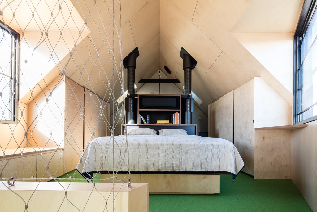
Instead of the grass you’d find in more traditional yards, a “lawn-green” carpet runs down the middle of the plywood-heavy interior. For a more realistic sense of nature, OOF! added a fully-functioning aquarium to the living rooms.

“[The family] have got fish in there, but it’s also like a bit of aqua-landscaping. There are aquatic plants that grow in the aquarium but they also grow out of it, a bit like creepers.”
As the final touch to the ‘garden’, a variety of hanging plants were strung from the ceilings.
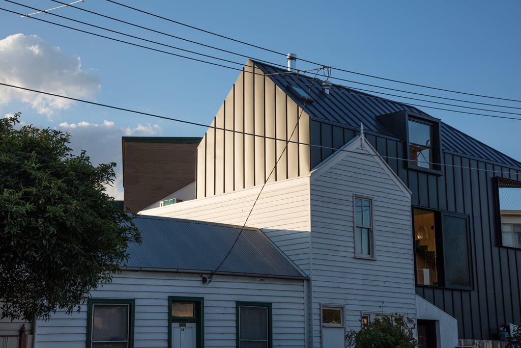
The façade of the building contained a whole other set of challenges for OOF!, mainly concerning the site’s heritage constraints. While OOF! wanted to contemporise the building, they also wanted to respect the integrity and charm of the existing materials.
“On the outside, one of the key decisions related to [the] heritage constraints of the site was that we kept as much of the old cottage as we could. All the bits and pieces that were virtually falling off we saved and re-installed,” says Khoo.

“The new parts [of the façade] are wrapped up in a metal cladding so that we get a beautiful, simple, smooth surface that we could attach the crazy, old weatherboard to. It’s a really nice juxtaposition, with really clean and new materials [paired] with those great, old, textural elements.
“It’s quite a contrast between inside and outside,” Khoo adds. “There’s a more formal, monochromatic outside, with a beautiful, warm timber on the inside and welcoming, green carpet that comes up through the middle. Some people are surprised by it, when they go inside.”
It wasn’t all smooth sailing, but in the end, OOF! used imagination to turn cramped quarters into a vessel that surprises – both inside and out.


