
Adelaide home extension explores vernacular for modern day
This home extension demonstrates a sincere attempt from the designer to balance the challenges of designing for a very particular context with designing for environmental performance.
This simple Adelaide home extension demonstrates a sincere attempt from the designer to balance the challenges of designing for a very particular context with designing for environmental performance.
Sans-Arc Studio (SAS) is the designer responsible for the modest 64sqm addition to a home in Carlisle and notes that the project was an exploration in a ‘modern-vernacular’ for the area, where the historical styles of Adelaide housing are interpreted in a contemporary and environmentally-conscious manner.
The brief for 48 Carlisle was simple, says SAS, the client wanted a clean, light-filled extension, primarily encompassing a kitchen, living, dining and outdoor areas. But balancing the client’s desire for a Scandinavian aesthetic while embracing the local vernacular and providing a high-performing home at the same time was where the challenge lied.
For that, the designers turned to their knowledge of Australian materials, solar passive design and thermal mass, and what resulted was a single, gable-roofed open volume that extrudes on a single east/west plane from the existing home into the backyard.
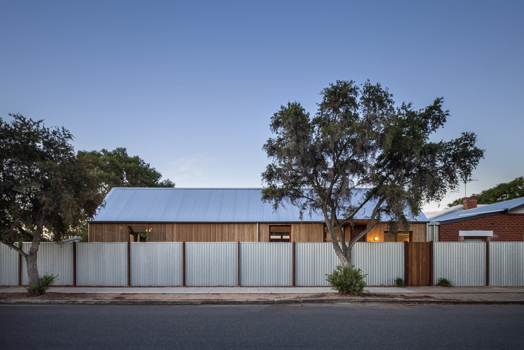
From the street, it’s easy to see where the contextual reference lies. The gable, says SAS, is a nod to the classic Australian housing within the area, and the use of galvanised custom orb and silvertop ash cladding create a connection to the local and greater Australian context.
 The extension, situated on an exposed corner site, creates an expansive yet private light-filled space
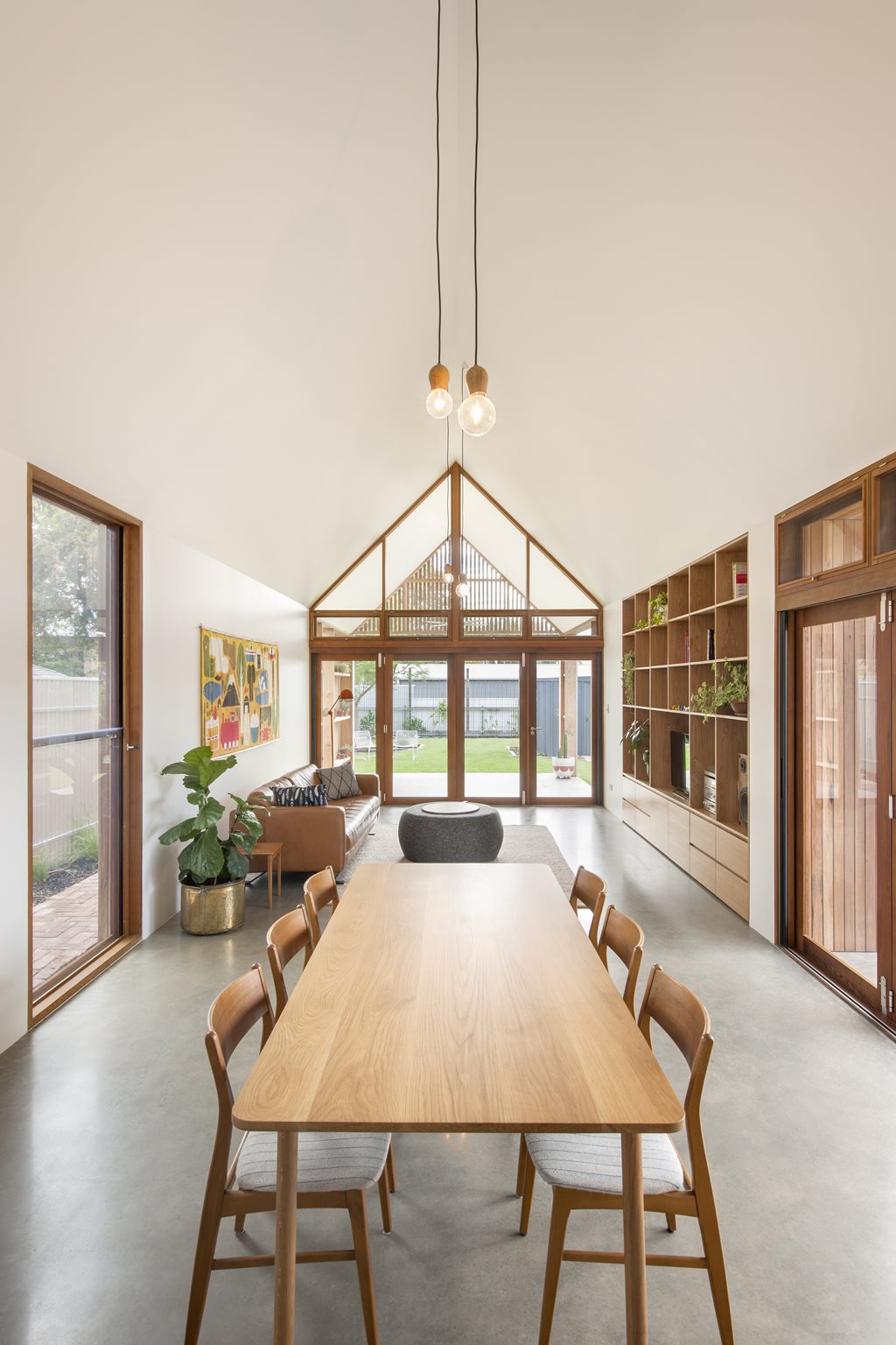
The single open volume maximises lines of sight internally and to the backyard, but creates a level of screening and privacy from the neighbouring street The gable ceiling and the natural ventilation draws cool air from the south and vents at high levels to the north and west. Extensive glazed windows allow for natural light, and are sheltered by canopies in the heat of summer
Imitation of the neighbouring gables was a priority for the designers but of equal importance was the creation of an open airy interior space for the client. A steel portal frame structure was chosen by SAS to address this challenge, and although it took a fair chunk of the budget, its effect is immediately noticeable when looking east/west down the building volume and along an uninterrupted sight line.
Inside, it’s all about layout, performance and comfort. The building is broken into four manageable spaces—kitchen, dining, living, and outdoor dining, which are all 4x4 metres. Reverse brick veneer, a hermetically sealed envelope and a concrete floor stabilise indoor temperature while the building’s open ceiling, windows and high purging vents create a stack effect to further improve thermal comfort and facilitate natural airflow. A hydronic underfloor heating system has been installed to top up the slab’s temperature when necessary in winter and windows are protected by external timber canopies in summer.


On a small block and budget, SAS has created a light-filled and spacious home extension for their client, one that pays respect to the local vernacular but without being shackled to it. The designers say that although building a standard box extension was an easy option, their considered resolution provides a functional, comfortable new living space that has the added bonus of being contextually relevant


