
The commercial tower that bridges Brutalism and Postmodernism
An A-grade commercial office building, originally built in 1988, this two-tower building straddles the design traditions of Brutalism and Postmodernism.
An A-grade commercial office building, originally built in 1988, this two-tower building straddles the design traditions of Brutalism and Postmodernism.
Despite being conceived as a unified space with a large atrium, over the years the ground-floor lobby—which spans both towers—had become disjointed, with ad-hoc retail tenancies and inconsistent materials and ceiling heights creating a somewhat messy series of unremarkable spaces.
Gray Puksand was engaged to unify these spaces, create a consistent design language, and modernise the ‘first impression’ of the building for workers and visitors.

“Our goal was to really unify the entire lobby space for the North Tower and the South Tower and to activate the ground plane, which is really the welcome mat for both towers,” says Gray Puksand state partner, Nik Tabain.
“Given that the building is located opposite Flagstaff Gardens, our primary aim was to get a feeling of bringing the park inside. That was at the heart of our design concept.”
The most obvious feature of the new interior that plays to this inside/outside feeling is the 30-metre long Junglefy ‘breathing wall’. With over 4,000 plants, the complex wall system works to filter the air in the space, creating a more breathable atmosphere. Within the central atrium, Gray Puksand has also added further planting, including a large tree.

However, the unification of the ground plane required some further clever solutions. Compared to a standard corporate lobby, the scale created some challenges.
“When you're dealing with a space this large, any cost and expense—on materials and finishes for example—is multiplied across the space. To get the quality that people expect, and that we demand of ourselves, is hard to achieve when you've got such an expansive space,” says Tabain.
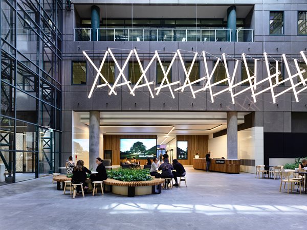
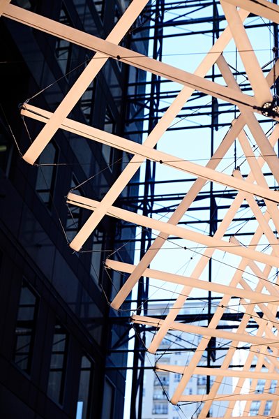
The design team worked within the budget constraints to bring coherency to the lobby. A single flooring type has been used throughout, while the ceiling heights have been made largely consistent and strip lighting has been used to define spaces, and for subtle wayfinding. Collaborating with lighting artist Jan Flook, a dinosaur-bone-like lighting fixture was developed to bring down the scale of the atrium space, creating a level of intimacy.

The renovation includes a new concierge desk, waiting area, coworking space, and cafe and retail tenancies. The brief also included a substantial end of trip facility, with bicycle parking, showers and lockers. Such amenities are usually placed in a building’s basement, but the ground-floor positioning at 485 La Trobe offers a much more pleasant experience for workers and works to further activate the lobby.
“You essentially come in, park your bike, and you've got this enormous tree in front of you when you get out at the atrium space, and you walk on to the shower and locker area. Again, it's about providing as much activity as we can through that ground-floor lobby,” says Tabain.

Working collaboratively with the client and the building occupants, Gray Puksand has developed a design that engages with the adjacent park, creates a more unified and usable lobby, and in turn gives back to the Melbourne streetscape.
“It really feels like a bustling internal street. We set out to bring the park inside, and we've done that successfully, but it also feels quite urban,” adds Tabain.
“Even people who don't work in the building are using the lobby now as an enjoyable walking route, rather than walking down one of the darker lanes.”


