
Durable interior finishes to help Whites Dispensary by Studio Equator age gracefully
Mixed timbers, clean stone and tiles and decorative concrete blocks that stand the test of time help to highlight Whites Dispensary's brand and ethos.
While retail stores often strive to stand out of the crowd with their designs and branding, most pharmacies seem to prefer sticking to an unchanging aesthetic of clinical aisles of health, beauty and wellbeing products.
But Whites Dispensary, a long running brand name in the Pharmaceuticals industry, changing things up with its new store was important in not just maintaining its reputation, but making it visually apparent.
Enter Studio Equator, who was asked to create a design that would highlight the company's brand name and keep current customers ensured of a positive change.
“We wanted to highlight a difference in its competitors within this industry and reposition the brand to better service the market, and in doing so, change the way companies behave in an industry that hasn’t changed in decades,” explains Carlos Flores, creative director at Studio Equator.
“We wanted all the rebranding to grow with the ability to change quickly and keep up with customer demands and challenges. Within our rebranding, we also ensured the design would improve the current financial mode, maintain sustainability within a smaller footprint and increase profit.”
Located in South Melbourne, Whites Dispensary was designed with minimal wastage in mind and according to the guiding principle of doing more with less. For instance, typical pharmacies use large shelving for display and storage, but the fitout for this project was kept open with smaller shelves and no storage. This means that all stock is necessarily displayed, which Flores says allows for a better footprint to be left behind.
Wanting to display all available stock heavily influenced the interior finishes, with high quality materials and products chosen for longevity of the design as well as aesthetics purposes. Durability was an especially important factor, as the client has a long term lease for the tenancy.
The high foot traffic within the space also contributed to the need for finishes that could stand the test of wear and time.
A number of different materials and products for the surfaces were explored to meet these requirements. One of the main specifications is the porcelain tiles by G-Lux Enterprises, sourced from Portugal, which run along the floor in four different colours and in a checkerboard pattern. According to Flores, porcelain was chosen over vinyl floor tiles because it will not discolour but maintain its quality over time.
Complementing the porcelain tiles is the Escape Velour flooring from Supertuft, which has been used to distinguish three key areas in the store as a representation of White’s overarching concepts – Health, Beauty and Wellbeing.
“We wanted to continue the raw and warm atmosphere by installing a ‘grass’ like carpet,” explains Flores, adding that the 100 per cent cotton carpet is easy to clean and comfortable to walk on.
The counter bench tops are made of Diamante Grigio coloured stone from G-Lux Enterprises, chosen because the marble is durable, easy to maintain and ‘indestructible’, and specifically designed to hold weight and keep its colour and quality.
Adding a touch of decadence to the store, the marble creates a waterfall effect over the counters and balances the warmth of the predominantly raw and organic interior. Recycled timber from Eco Timber Group, acting as a counterpoint to the stone but helping to generate an urban and industrial feel, was used for the walls of the counters and shelving.
At the same time, Laminate from Laminex in black was used for all shelving, while the ceilings are finished in Dulux white low sheen acrylic paint.
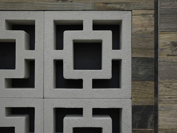
The durability also extends to the decorative concrete blocks used throughout the space, says Flores.
“The blocks are used as a frame for shelving as well as for decorative purposes. As they are completely made of concrete, they are a strong and a durable outdoor material known to never age or lose its quality. The same applies with the hardwood timber used for the shelving frames and counter splash backs,” he notes.

Further differentiating the fitout from traditional pharmaceutical design is the use of bespoke materials, which were employed for the space in a sculptural manner, such as in the signage. Shelves with medicinal bottles and showcases double up as lighting features, and are reinforced by motif quotes from famous thinkers that “health is the true wealth” – Whites Dispensary’s ethos.
“My favourite part of the project was to see the higher purpose and vision realisation of a disruptive brand objective. Fulfilling the brief is always the most exciting part of the project and in particular seeing the measurable outcome for this particular project,” says Flores.
“Being a very clichéd industry in terms of visual identity and physical fit out, seeing the results, profit turnover and seeing the brand better positioned in its industry above the competitors has been great.”


