
Gravity Tower: A unique response to housing in a flood zone
Fisherman's Bend has some level of flood risk, requiring innovative design, such as the use of car park flood barriers and a sacrificial flood zone within the building.

From the architect:
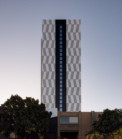
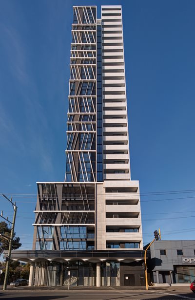
The first completed project of the significant urban renewal precinct of Fishermans Bend, Gravity Tower is a 29 level apartment building located on a prominent intersection in South Melbourne. The building composition comprises a Podium, concrete Spine and glazed Lantern.
The Lantern houses the majority of the dwellings and is highlighted by the 70m high brise soleil protecting the residents from the harsh Australian sun.
The Spine, holding the elevator core and two-bedroom apartments at each side, rises in contrast to the angled louvres of the Lantern. The top of the Spine houses a series of communal spaces, including a cinema, dining, lounge, spa and BBQ area, to foster a sense of community amongst residents.
Lastly, the six-storey Podium creates a street wall with the tower mass set back from the corner boundaries. Within the Podium is a ground level restaurant, residents’ entry lobby and the carpark entry.
A UNIQUE DESIGN

The initial design response was informed by the challengingly small site size. Inspired by Melbourne’s famous laneways, the urban design strategy enabled the tower to be built on the southern boundary with zero set back.
The precinct has some level of flood risk and due to Fishermans Bend’s strict flood regulations, innovative design, such as the use of car park flood barriers and a sacrificial flood zone within the building, were incorporated. The building was designed with no basement level parking and a raised ground floor to account for flooding. The challenge was to design retail and hospitality spaces which were raised 1.5 metres above street level – yet would still remain activated and welcoming to the public. The carpark entrance features an innovative floor barrier which is designed to raise when floodwaters are present and act as a dam wall, protecting the parking facilities if necessary.
The chevron super graphic pattern on the outside of the Lantern speaks to the speed and scale of the macro size of the freeway and city vista beyond. The scale and motion of this articulated pattern flows and changes depending on the viewers location, presenting a new interaction at every angle. The design approach of this development is strongly informed by both the present day and the future context as well as the potential developments that are expected to neighbour it. The design captures the optimism and vision of this new part of Melbourne.
SUSTAINABILITY FEATURES
The angled chevron fins provide a striking visual pattern, while their careful placement protects apartments from the western sun while providing views back towards the city. This allows for reduced cooling requirements while still providing full height canopy, inset wind columns and no-go zones at the site corners and perforated facades to podium parking levels.


