
Harshness and beauty at Karratha Central Healthcare
Coda Design Studio's project creates an architectural shelter from the weather’s extremes, while achieving a sense of privacy – and beauty – for staff and patients.
Harshness and beauty live side by side in the remote, Western Australian township of Karratha. These are also the realities of life within Karratha Central Healthcare, with the former mitigated by a colourful, welcoming and sensitive design from Coda Design Studio.
Coda was commissioned as the project lead in 2013 by the Pilbara Health Network. The decision to design such a healthcare centre followed the region’s inclusion in 2009 as part of the state government’s Pilbara Cities program, which aimed to build the area’s population.
The design for the Karratha Healthcare Centre was meant to embody a new vision for the area. But as much as it was representative of Karratha’s future, it also needed to respect the landscape and the people who lived on it.
Of particular importance was the Indigenous culture that is sunk deep into the fabric of the land. For more than 30,000 years, the Pilbara region has been occupied by ancestors of the Ngarluma, Yindjibarndi, Marthudunera and Yaburara people. Sometime during that 30,000 years, it became a sought-after resources hotspot, attracting thousands of fly-in-fly-out workers. Today, it is increasingly where industry workers and their families are choosing to put down roots.
The growth necessitated a corresponding investment in resources and amenities for the local population – both old and new. The Karratha Central Healthcare centre formed part of a government-backed plan that included more open space, more housing options, more community facilities, and more infrastructure.
Patient experience was at the heart of Coda’s design for Karratha Central Healthcare. Necessarily, the climate was another predominant consideration – a consideration whose importance was reinforced when Tropical Cyclone Stan interrupted the centre’s construction.

“Our briefing and design responded to the cultural values of Indigenous clients, [and] particularly how they experience enclosed spaces and the understanding of cultural traditions for privacy. This is reflected in the open, bright and interconnected interior and exterior spaces,” says Coda in a design statement.
“Movement and patient waiting areas have been carefully crafted to allow for cultural obligations, including avoidance of related male and female Indigenous clients.
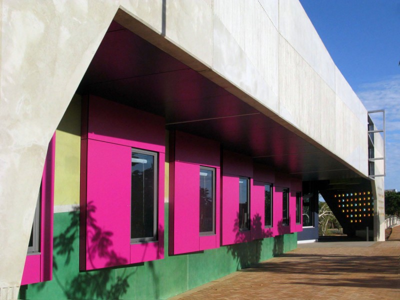
“The building design responds to the harsh, hot, dry climate condition of the Pilbara, employing a self-shading strategy for protection from the sun to create [a] shading form of deep verandahs, colonnades, balconies, awnings or screens.”
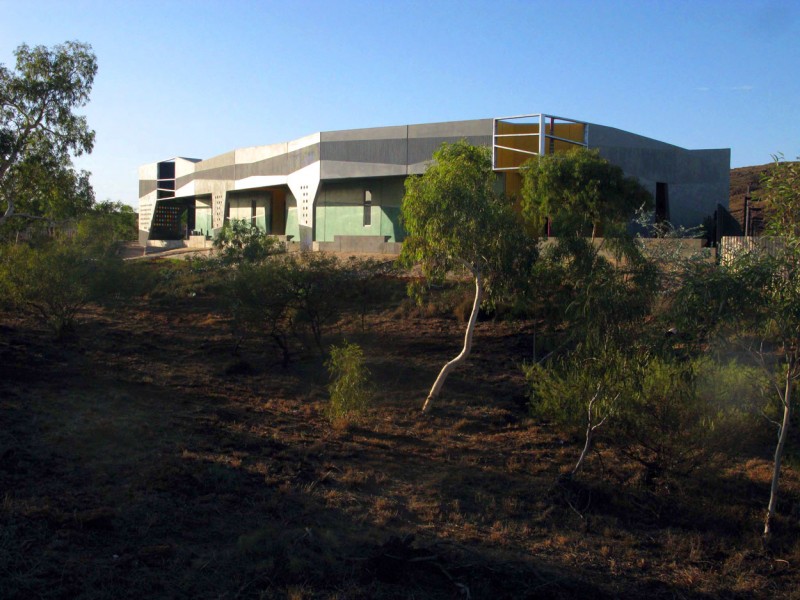
The most obvious example of these twin considerations is the folded floorplan. The single-storey building has been formed into a U-shape, divided into three distinct sections: one for clinical areas and consulting rooms, another for corporate offices and educational spaces, and a third that acts as a waiting area. The inward-looking shape of the centre creates an architectural shelter from the weather’s extremes, while contributing a sense of privacy for staff and patients.
The waiting space is central to the floorplan; it is the liminal space between public and private. This reception area – the first experience that visitors and patients have when they enter the building – is painted a soft yellow. As much as this colour choice references the tropical context of the centre, it is also a warm, welcoming and “happy” colour; antithetical to the sterile stereotypes of hospital waiting rooms.
But this waiting area is not the first indication that Karratha is an iconoclast of hospital design. The façade – an arrangement of pre-cast concrete panels – is punctuated with colourful cut-outs: hot pink squares around the windows, and kaleidoscopic peep holes that cast coloured light through robust walls.

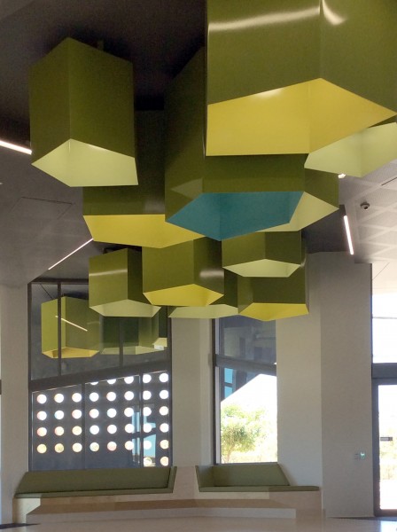
This play of light, shadow and colour continues throughout Karratha’s interior. Ceilings are laden with hollow, pastel-hued stalactites in a variety of geometric shapes. As light comes in through the windows – of which there are many – the colours are thrown throughout the interiors, brightening and lightening the space for patients. Lofty ceiling heights further enhance this chimerical sensation.

Colour is an overarching theme of Karratha Central Healthcare. Two considerations underpinned the specific selection of colours: the landscape, and patient experience. (To recall, these twin concerns underpinned the centre’s design more generally.) For instance, the soft greens are taken from the seasonal grasses of the Pilbara landscape, and shades of purple and yellow refer to wildflowers native to the area.


