
Test-bed for healthcare model: Mornington Centre Stage 2 by Billard Leece Partnership
Can a certain building material or design diagram be evidenced to show a positive effect on humans? Can we use this to our benefit when designing in health and aged care environments?
It has been a question circulating design circles for some time. Many consider the answer intuitively obvious but proving assertions with quantitative research has always been an issue.
Can a certain building material or design diagram be evidenced to show a positive effect on humans? And can we use this to our benefit when designing in health and aged care environments?
The Mornington Centre Stage 2 building on Victoria’s Mornington Peninsula could serve as a great Australian test bed for answering these questions as it features a contemporary material palette that is generally foreign to healthcare environments, as well as a host of new design elements aimed at helping people recover more comfortably.
The Centre is part of a broad masterplan for the staged development of a large integrated centre for the Peninsula region, south of Melbourne, Australia. Providing clinical services that promote health independence for the aged, the facility includes a 30 bed inpatient ward on first floor and an integrated ambulatory care centre at ground.
BRIEF
The brief was to provide an environment to care for dementia patients with an average length of stay approximately 28 days; a supportive setting to encourage mobility and teach independence.
The architects divided the vision principles into three sections; Internal, Ward and External principles
Internal vision principles:
- Surveillance and safety
- Recognisable landmarks
- Homelike/small broken up spaces
- Light filled
- Quiet spaces low on stimulation
Ward vision principles:

- Walking and wandering to achieve goals and to meet
- Promoting opportunities for social interactions for wellbeing
- Passive observation by staff
External vision principles:

- Extensive pacing area (looped)
- A series of separate spaces with discrete functions (nooks and crannies where people can have the feeling of getting away though still being observed by staff)
- Security
- Interactive garden
- Shaded and weather protected areas
DESIGN DESCRIPTION
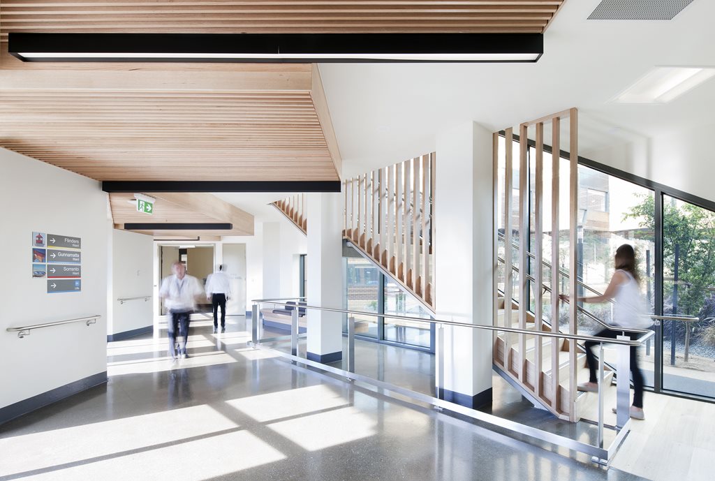
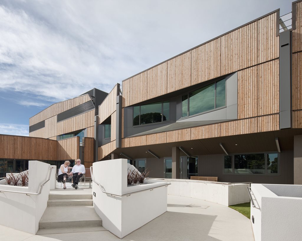
A primary driver for the building is the suburban coastal context. Both externally and internally, in material and form, the building alludes to the roots of the coastal shack. The pitched parapet profile mirrors the dominant modest suburban house form. The building is almost entirely clad in white cypress timber with deeper battens that accentuate texture and provide differing patterns across the length of the façade.
With its imposing volume and intricate polychrome brick façade, the existing Stage 1 building posed difficult questions of integration. Despite the significant difference in materiality, the highly textural nature of the new building’s timber façade and chosen chromatic palette facilitated connection to the existing.
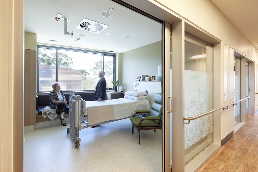
The inpatient ward on the upper level was designed specifically for the memory impaired, with an average length of stay of approximately 28 days. The challenge was to create an environment that respected patients privacy while providing an open light filled space that maximised the opportunity for staff supervision. As a result, a new model of ward layout was developed. Building off the racetrack model, two internal courtyards were introduced. As well as bringing light and space to what is traditionally a deep floor plate, the small courtyards create an extension to the track of patient wandering. In close visual and physical proximity to staff they allow patients to wander freely while still being safely supervised and become an extension to the therapy spaces. Large glazed sliding doors to bedrooms further maximise the opportunity for supervision, with decals and blinds providing required privacy.
Bedrooms are designed with an attention to the detailed requirements of the aged and memory impaired. Bed heads incorporate required clinical aspects on returns therefore minimising the impact of the ‘mechanics’ of the hospital room. A shelf above the bed provides an area for personalisation – photos and personal memorabilia are important in treatment. A window seat provides for relatives, as well as doubling as a second bed. Additional mattress storage is inbuilt within each room – for this patient cohort mattresses are sometimes placed on the floor to minimise the risk of falls.
SUSTAINABILITY INITIATIVES
- Timber sourced from intensively and sustainably managed forests, with certification in accordance with Australian Forestry Standard AS.4708 and full chain of custody
- Utilisation of natural wool insulation beyond minimum legal requirements.
- The incorporation of self-shading windows with the utilisation of high performance glazing over minimum requirements.
- Mixed mode ventilation to all areas, including the use of thermal chimneys to enhance ventilation when windows are open.
- The provision of Feed Screens within public areas displaying resource information with usage data relative to targets/benchmarks.
- Specification of high efficiency fans and motors to reduce energy consumption.
- Specification of larger ducts and efficient air handling equipment to reduce the work required by fans and thereby reducing energy consumption.
- Utilisation of intelligent lighting controls, including daylight sensors to corridors and patient areas.
- High efficiency chiller plant and higher efficiency condensing units.
- CO2 monitoring and control to allow for the adjustment of outside air rates to suit occupancy levels.
- Rainwater harvesting for toilet flushing and landscape irrigation.
PRODUCTS
INTERNAL PANELLING
Sycon Grooved FC Board
MAIN STAIR, TIMBER THREADS AND BALUSTRADING BATTENS
Victorian Ash
ALCoatings, low VOC clear 2 pack water based polyurethane topcoat E8070 + Catalyst with primer E8051
CEILING BATTENS
Victorian Ash, tapered vertical edge
Two coats of low VOC water based polyurethane clear satin finish
EXTERNAL CLADDING
Frencham, DesignAclad white cypress sawn face with boards varying widths and depths.
Quantum, Aquaoil Quantec deep penetrative water repellent water dispersed oil coating


