
The whimsical children's hospital designed from a child's perspective
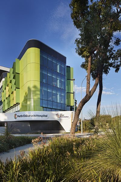
Driving past, the animated lighting of artist Stuart Green’s “fizz” sculpture and the green façade instantly identifies the children’s hospital, a visual wonderland for families driving past at night.
Driving along Winthrop Avenue, the animated lighting of artist Stuart Green’s “fizz” sculpture and the green façade instantly identifies the children’s hospital, a visual wonderland for families driving past at night. Vast areas of north-facing glass enable the child and their family to catch a glimpse of the sculpted forms, artwork and play areas, reducing the anxiety of the child to their environment.

Natural inspiration
The design team’s starting point was to anchor the hospital in its unique surroundings. The nearby flora and fauna of King’s Park inspired a concept for the building based on petals and a stem.
“The composition of the building is directly inspired by nature,” says Fernando Faugno of Cox Architecture.
“The elegant floral forms of Kings Park have been key in the general shaping of the building and the curvaceous sculptural forms carry through the general theme of the architecture. The design has a gentle flow which adds to its humanity and sense of welcome.”
Embedded in the organic structure of “stem and petals”, the arrangement of the building emerges as a fluid, connected sculptural piece. The fanning petals house the children’s ward, maximising natural light and views to the south and east. Each petal offers every room natural light and vistas to the sky and land.

Children-first approach
A hospital visit can be a very daunting experience for a sick child. Hospitals are vast buildings, which are often associated with a bombardment of signs and other information, long endless corridors, noisy waiting areas, and those awful smells. It’s understandable how a child’s anxiety can increase significantly on their way to see a doctor. This is where Perth Children’s Hospital is different.
Everything from the journey into and through the hospital to the finest details have been considered and recalibrated for a child’s perspective; from lowered window seats to pops of colour and visual treats which are at the level of the child and for them alone, and may even be missed by the adults. The interiors are not themed as such, but designed as a series of destinations, with bright colours and organic shapes marking prominent landmarks along the way.

The reception desks appear carved out of a single shiny warped form. The seating pod areas are not just for sitting, but for climbing, hiding and exploring. Geometric cut-outs (which double as window seats) mark the entry to each of the play therapy areas. The staff stations in each of the inpatient areas are designed as treehouses.
Playful
The atrium space at the heart of the hospital is a hive of activity and wonderment. It is easy to find the playful main reception desk inside the main entry. It has been designed so that there are no visual impediments to seeing even the smallest of children. Looking up into the atrium, suspended mobiles reflect sparkles of light through the space, providing a cascade of kinetic petals throughout the day, and the rolling and bulging forms of the balconies around the central space suggest a place of play rather than sickness.
Designed for parents and their families
More than 75 percent of the patient rooms are single rooms allowing the child and their family the privacy and control of own their room for the length of their stay in hospital. The room is also designed to reduce a child’s anxiety and is created from the perspective of a child in their bed. From here, the child can see out the window with some fantastic views, many of them across Kings Park and to the Swan River. There is a family zone under the window with enough space for a parent to stay overnight, and for siblings to play.


