
What Australia’s public spaces can learn from Snøhetta’s Times Square transformation
How do you make the busiest place in the United States even busier? Why, you double its capacity for foot traffic.
Times Square is the busiest place in the United States. The public-square-on-steroids attracts around 45 million visitors each year (and counting), and is a cultural hub of theatres, attractions, restaurants and local characters within the already ample cultural hub of New York City.
So, how do you make the busiest place in the United States even busier? Why, you double its capacity for foot traffic.
In 2010, Norwegian-American architectural firm Snøhetta was chosen to undertake an extensive urban reconfiguration of the iconic Times Square. Officially opened last week, the reconfiguration – comprising nearly 20,650 square metres of landscaping – is of a scale almost as impressive as the glowing billboards that tower over the space in all directions.
Not just a matter of widening footpaths (although that was a substantial part of the makeover), Snøhetta aimed to make the space safer and restore its ‘authenticity’. This was done by ensuring the new features expressed sensitivity to what made the space so attractive to begin with.
“Although Times Square has remained popular over the years, its popularity over the years had made it somewhat unsafe, polluted and sometimes uninviting,” remarked Snøhetta partner, Craig Dykers, at the opening event. “To some people, it lost its authenticity.”

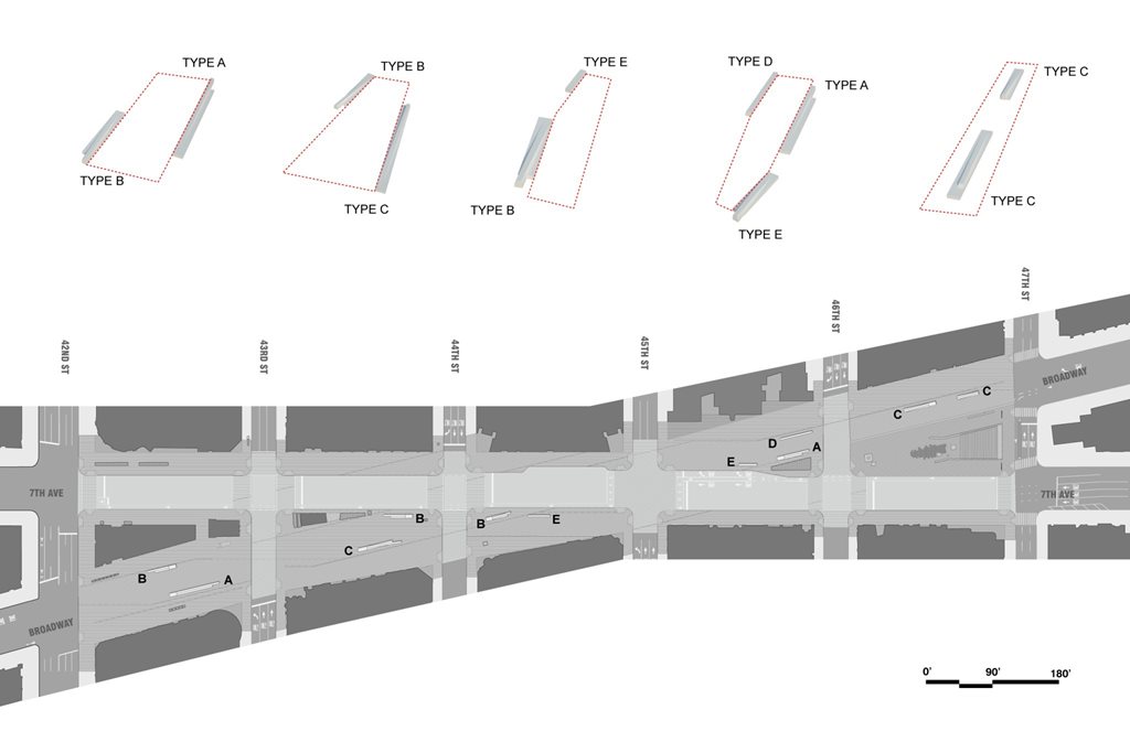
Aside from widening the footpaths along one of the main thoroughfares, 7th Avenue, Snøhetta created five new plazas. These now sit on each of the intersections between 42nd and 47th Streets.
Recognising that Times Square is less a thoroughfare than it is a giant, roof-less theatre, much of Snøhetta’s work went into ensuring that the public space doubled as an outdoor stage. Pre-cast concrete pavers now cover the ground in two different finishes, with steel discs inserted in some of these so that reflections from the towering billboards – one of the main performers at this theatre – can also be seen with downcast eyes.
Of course, every great theatre needs seats for its guests, so Snøhetta added additional street furniture in the form of ten long, granite benches. These measure between nine to fifteen metres in length, and are equipped with electrical plug points in case power is needed for broadcasting purposes.
Finally, street clutter that inhibited pedestrian movement was removed. For instance, excess traffic signals and bins were either combined or removed entirely.
“On average, 330,000 people move through Time Square every day,” said Snøhetta. “Understanding the magnitude of these crowds and patterns of movement was fundamental to creating a successful new life for one of the most iconic public spaces in the world.
“[The] design creates uncluttered pedestrian zones and a cohesive surface that reinforces the Bowtie’s [the colloquial name for the bowtie-shaped strip of street that forms one of Time Square’s main concourses] role as an outdoor stage.”
Snøhetta’s Times Square example is one that architects working on urban renewal projects in Australia should take note of. When so much of our urban rejuvenation consists simply of widening footpaths or ‘pedestrianising’ thoroughfare roads – thereby driving traffic to other pedestrian-heavy areas nearby – it’s important to remember why a space matters to people, and how they act and move when they’re walking throughout it.
But please, don’t get rid of all the bins. Sometimes, there are simply too few of those.


